


Stand Horecava 2026

Details
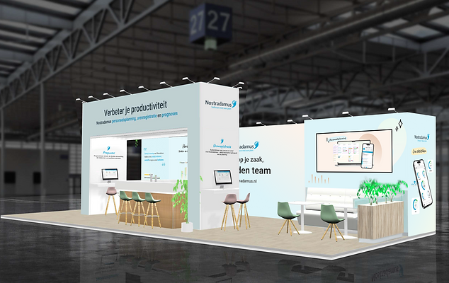
For this project I designed the graphic panels for Nostradamus's exhibition stand, translating their updated brand identity into a physical space. The stand originally used a dark navy and charcoal color scheme; as part of a brand refresh, I redesigned each wall to reflect the new lighter, blue-and-white palette, while keeping the layout, product screens, and messaging structure consistent across both versions. I was responsible for the visual design of each individual wall composition, imagery, typography, and how the brand colors translated into a large-format physical environment.
I also produced a motion graphics video in Adobe After Effects to be displayed on the stand's screens, extending the same visual identity into a moving format.
I collaborated closely with the marketing team throughout: they gathered internal feedback from stakeholders and made the final creative decisions, while I iterated on the designs to match.
